


Concept and graphic design for three proposed approaches to a brand visualization refresh for Subway, with typographic emphasis. This project happened in tandem with a photography style revamp for point-of-purchase materials. The concepts below were my contribution among many proposed to the client and part of an ongoing project when I left my contract with Jack Morton (2020).
Creative direction: Stephanie Caruso, Jack Morton Worldwide
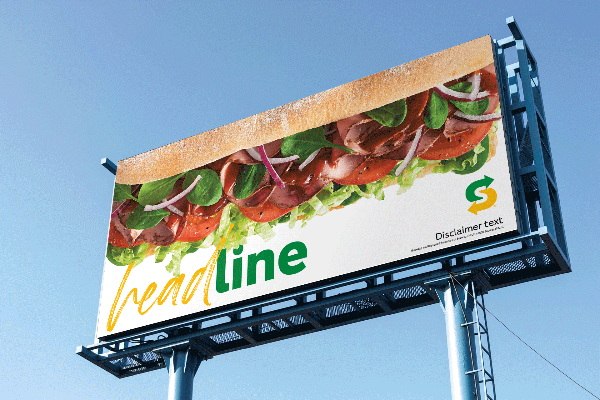
This first approach focuses on the concept of handmade, using prominent visual emphasis on food photography and typographic treatment that incorporates a handwritten script. This concept was selected by the client to move forward and develop further.
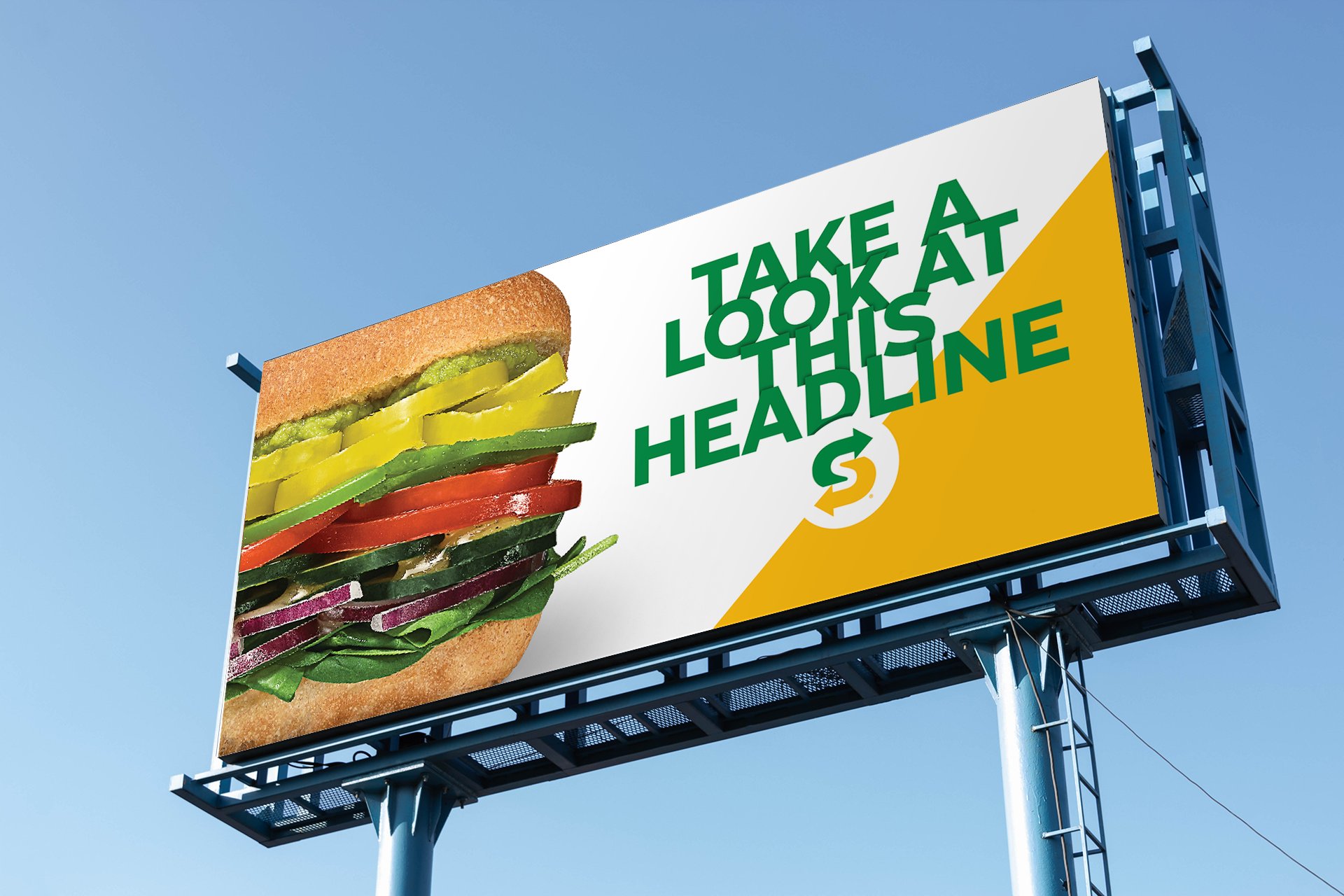
This approach takes special interest in the layers of ingredients that make up the build of the sandwiches, and utilizes typography to replicate that layered visual effect. Photography in these layouts gets up-close to detail the layered fresh ingredients as well.
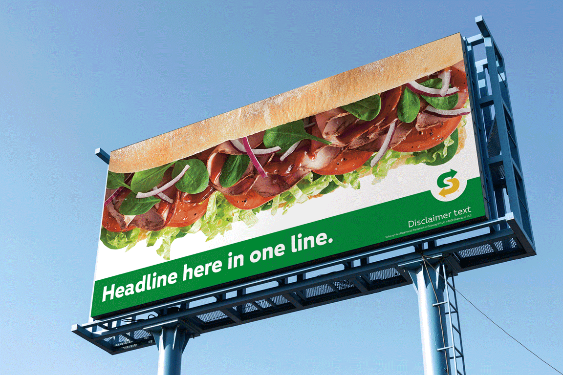
This approach keeps things contemporary and classic Subway, with simple design and layout that really allows the food and ingredients be the focus.